
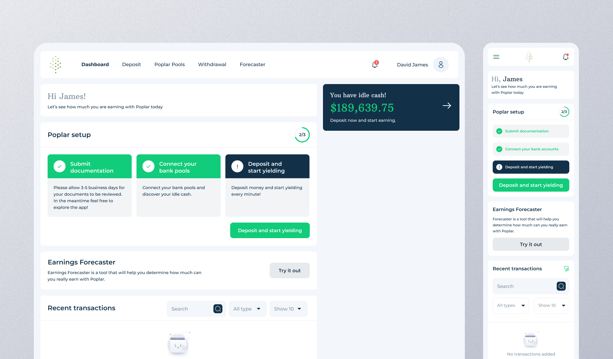
Poplar Money

The Brief
Poplar is a financial platform that helps users put idle cash to work by automatically depositing funds into yield-generating strategies. The goal of this project was to design a clear, trustworthy, and frictionless automated deposit flow that enables users to confidently set up recurring deposits while understanding risk, conditions, and expected outcomes. The experience needed to balance financial complexity with simplicity, ensuring users feel in control at every step.

Objectives
- Enable users to set up automated deposits quickly and confidently
- Clearly communicate: Deposit amount & frequency Rules and conditions Investment strategy allocation Risk and recommendations
- Reduce user anxiety around automated financial actions
- Create a scalable flow that works for desktop and responsive layouts
Target audience
- High-net-worth individuals with idle cash in checking accounts
- Users who want hands-off investing without losing visibility or control
The Approach
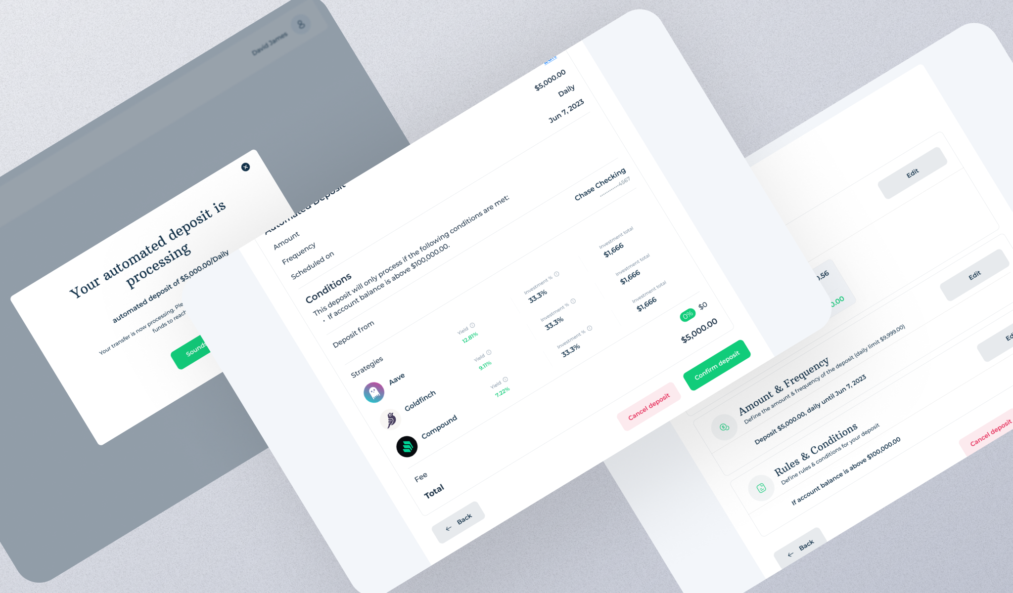
1. Structured, Step-by-Step Flow
The automated deposit experience was broken into clear stages:
- Source Account Selection – showing balance and idle cash
- Amount & Frequency – defining deposit rules and limits
- Rules & Conditions – ensuring safety thresholds (e.g. minimum balance)
- Preview & Confirmation – full transparency before execution
- Success State – reassurance and next-step clarity
This structure reduces cognitive load and mirrors how users mentally model financial decisions.
2. Transparency First
Financial trust was a core design principle:
- All values (amounts, percentages, yields, fees) are visible before confirmation
- Investment strategies show:
- Yield percentages
- Allocation percentages
- Exact dollar amounts
- Warnings and recommendations (e.g. exceeding suggested limits) are surfaced before confirmation, not after
3. Clear Visual Hierarchy
- Key actions (Deposit, Preview, Confirm) are visually emphasized
- Secondary actions (Edit, Cancel) are accessible but not distracting
- Status indicators (steps, progress, success modal) help users always know:
- Where they are
- What happens next
4. Confidence Through Feedback
To reduce anxiety around automated money movement:
- Preview screens act as a final “safety check”
- A success modal confirms the action immediately
- Clear messaging explains processing time and what to expect next
This reassures users that the system is working on their behalf.
5. Scalability & Responsiveness
The design was created to:
- Work across desktop and smaller viewports
- Support future expansion (more strategies, conditions, forecasting tools)
- Maintain consistency with Poplar’s broader dashboard and design system
Outcome
The final experience delivers:
- A clear, intuitive automated deposit flow
- High transparency for financial decision-making
- Reduced friction and hesitation around automation
- A strong sense of trust, control, and clarity for users managing large sums

Let’s Build Something That Converts
